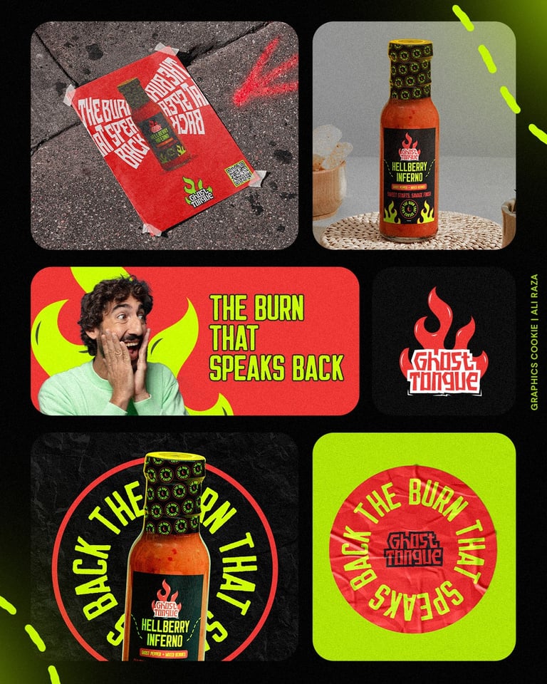
Ghost Tongue is not your average hot sauce. It’s heat with attitude—a slow burn that sneaks up, hits hard, and lingers long. With bold flavors and branding to match, Ghost Tongue is for those who chase the thrill, not just the spice. Designed to haunt your taste buds—and your shelf.
Ghost Tongue, a bold new hot sauce brand, needed a visual identity that matched its fiery flavor and edgy name. The challenge was to stand out in a saturated market of hot sauce brands while appealing to heat lovers who crave something a little dangerous, a little underground, and a lot memorable. They wanted branding and packaging that felt dope, intense, and irresistible on the shelf—not just another flame logo or chili illustration.
THE PROBLEM
THE SOLUTION
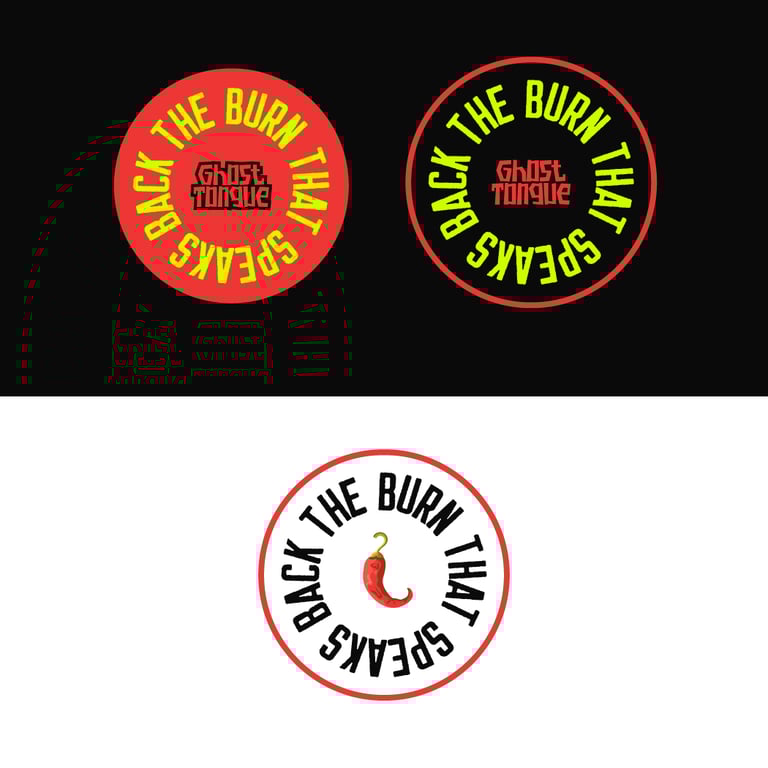
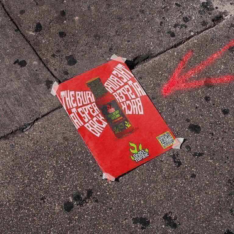
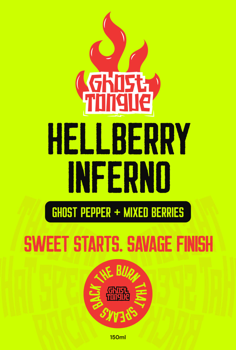
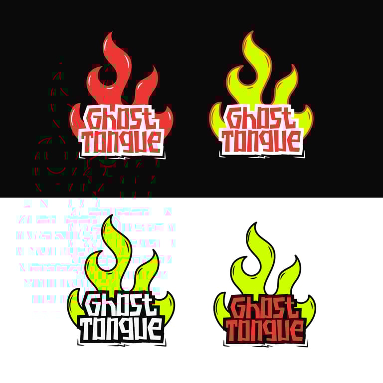
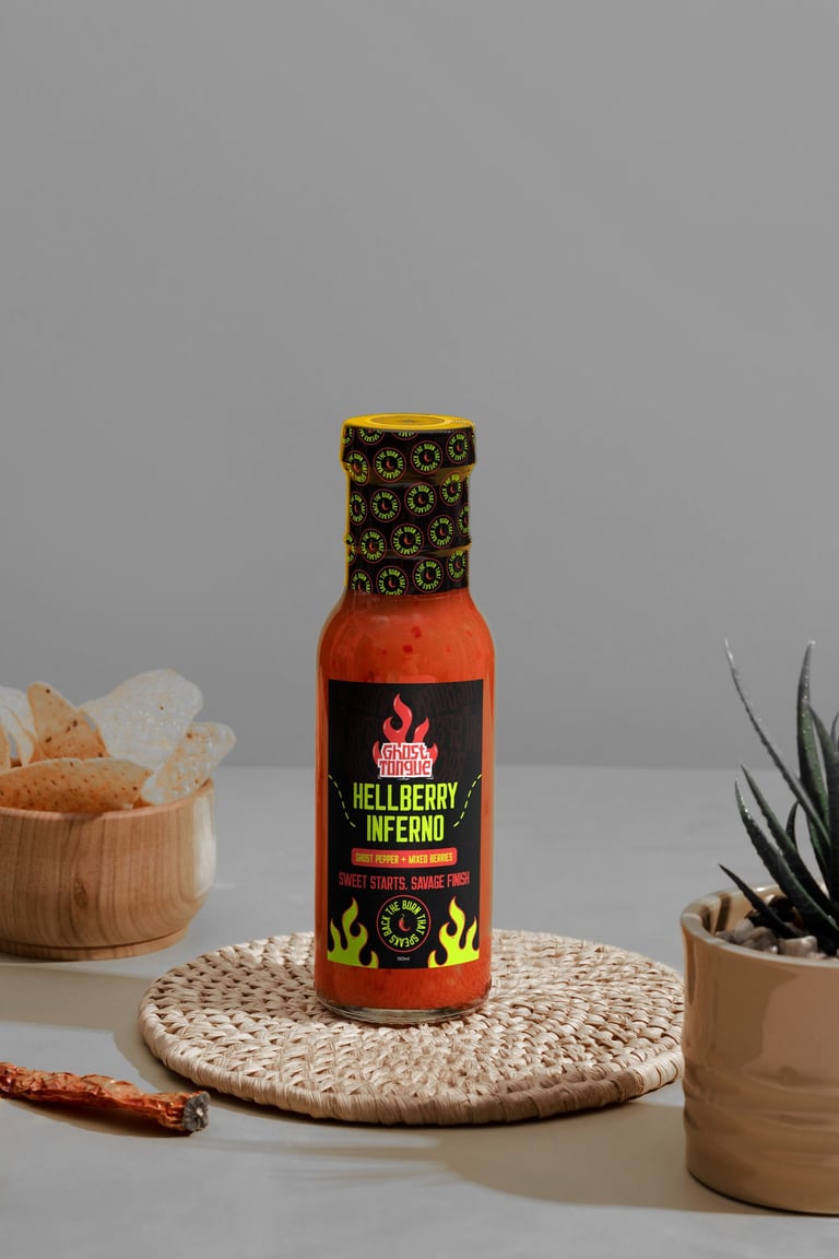
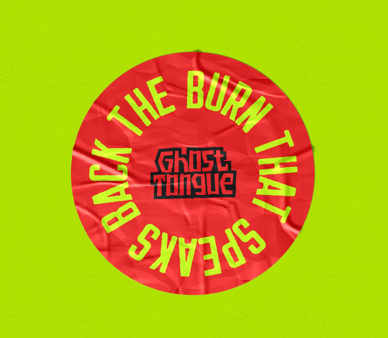
I created a full visual identity that’s as bold and punchy as the sauce itself. The logo design fuses sharp, aggressive typography with a ghostly twist—implying heat that haunts your tongue. The color palette leans into high-contrast tones (deep black, blood red, and acidic greens) to evoke danger and flavor. For the packaging, I designed layered textures, custom iconography, and label layouts that feel gritty, underground, and streetwise—like something you’d find in a tattoo shop or indie food market.
PHOTOS