Harvester Farms delivers pure, natural honey crafted with care and tradition. Rooted in sustainable practices, our honey captures the richness of nature in every jar—simple, clean, and golden.
Harvester Farms, a local honey producer known for its pure and sustainable harvesting methods, was ready to take their product to a more upscale market. But their existing packaging didn’t match the premium quality of the honey inside. It felt too rustic and homemade—failing to appeal to modern, health-conscious consumers who shop with their eyes first. They needed a sleek, elegant design that could elevate their brand and hold its own on high-end store shelves.
THE PROBLEM
THE SOLUTION
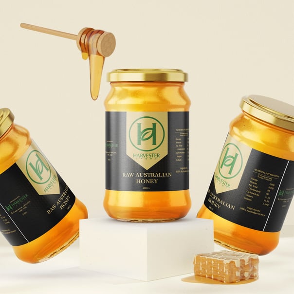
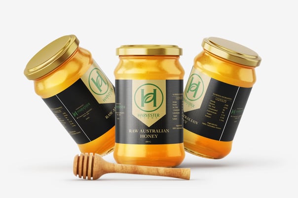
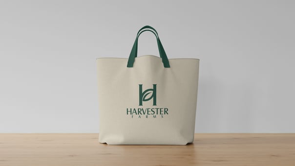
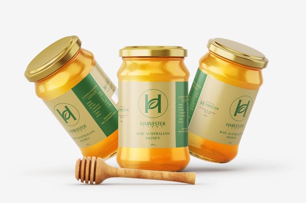
I designed a refined, minimalist packaging concept that gave Harvester Farms a fresh identity while honoring their organic roots. Using clean lines, elegant serif typography, and a subtle gold accent to hint at the richness of honey, I created a jar design that looked both artisanal and luxurious. The label featured a matte finish with strategic gloss highlights—creating a premium tactile feel while keeping things simple and sophisticated. This sleek new look gave Harvester Farms the brand elevation they needed to confidently enter upscale markets and gift shops.
PHOTOS
