Lumiéra was launching a premium skincare line with real results, but no identity to match the luxury inside. The product was rich, radiant, and full of care. However, the brand lacked the elegance and consistency needed to stand out in a competitive beauty market. They needed more than a logo. They needed a full sensory experience that reflected their values.
Lumiéra’s packaging felt generic and disconnected from the product’s quality. In a space crowded with loud, trendy visuals, the brand was missing the calm confidence expected from a premium self-care line.
THE PROBLEM
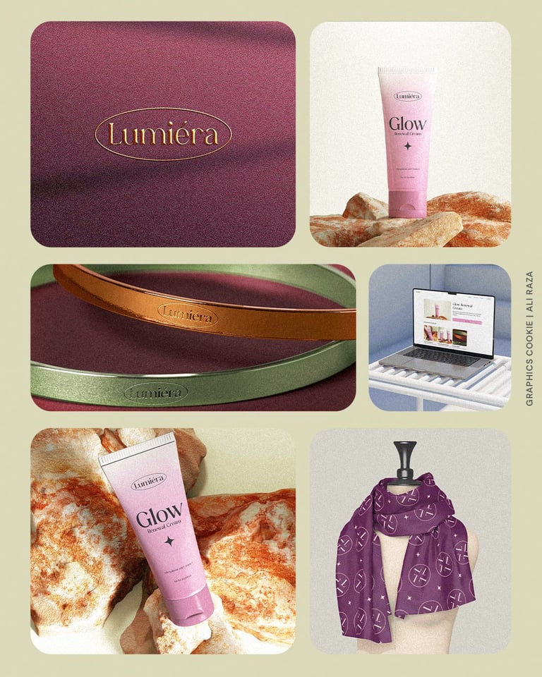
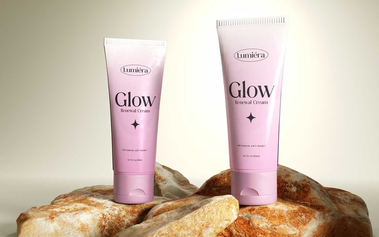
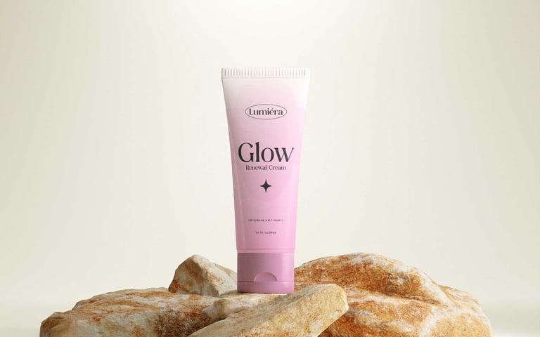
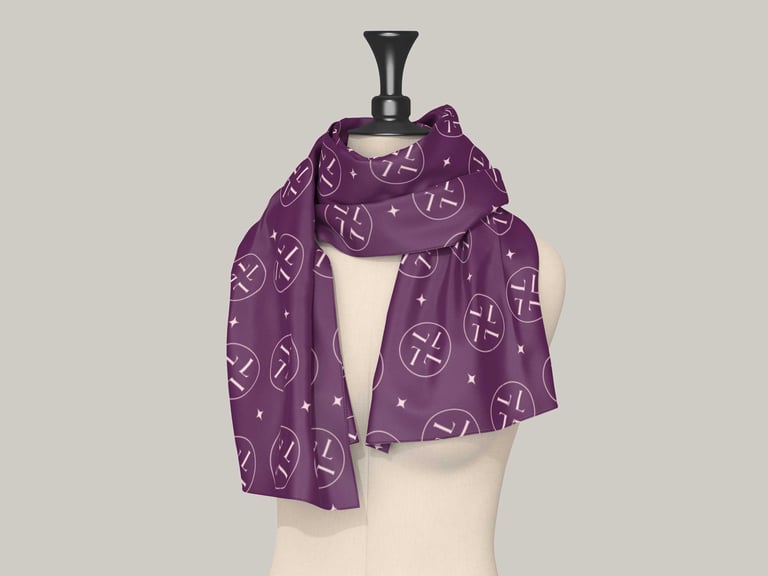
THE SOLUTION
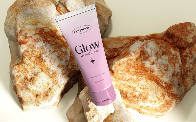
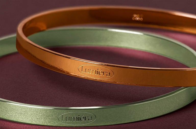
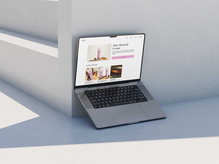
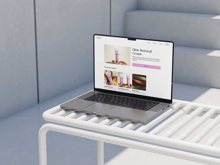
I designed a refined identity and packaging system rooted in softness and sophistication. A serif logotype within an oval shape became the brand’s signature. The color palette focused on rose pinks, deep plum, and subtle metallics. I applied these across product design, visual assets, and merchandise. Every detail, from embossed tins to a custom pattern scarf, was crafted to feel elegant, grounded, and emotionally resonant. The result was a skincare brand that looked as nourishing as it felt.
Photos