MAZE is a modern rental service designed exclusively for couples seeking more than just a place to stay. They offer beautifully curated apartments and intimate rooms that spark connection, comfort, and unforgettable memories. Whether it's a romantic weekend getaway, a honeymoon retreat, or a spontaneous escape, MAZE creates the perfect setting for love to unfold.
MAZE, a startup offering curated apartment and room rentals for couples, was ready to launch but lacked a solid brand foundation. They had the concept, the properties, and a clear niche—but no visual identity to tie it all together. Without cohesive branding or guidelines, every marketing touchpoint felt inconsistent. They needed a look and feel that would emotionally resonate with couples and give their team direction moving forward.
THE PROBLEM
THE SOLUTION
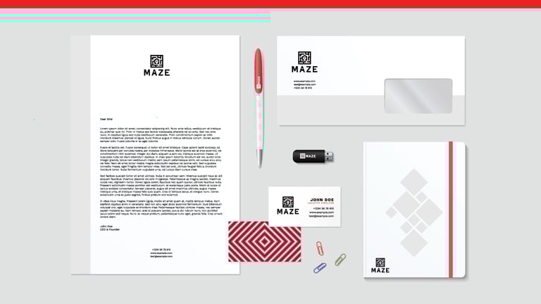
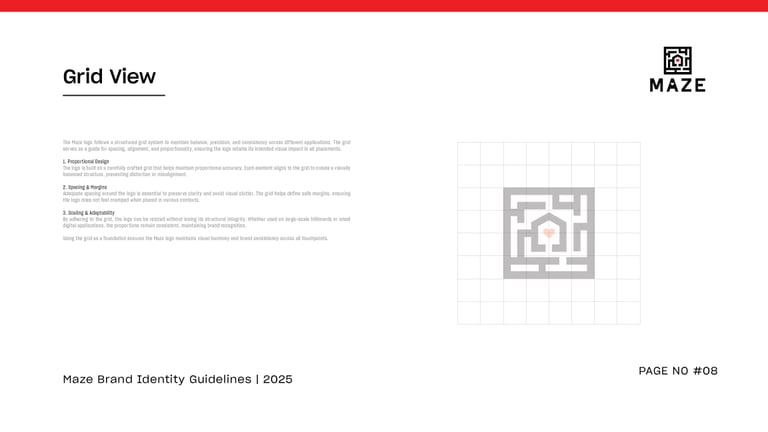
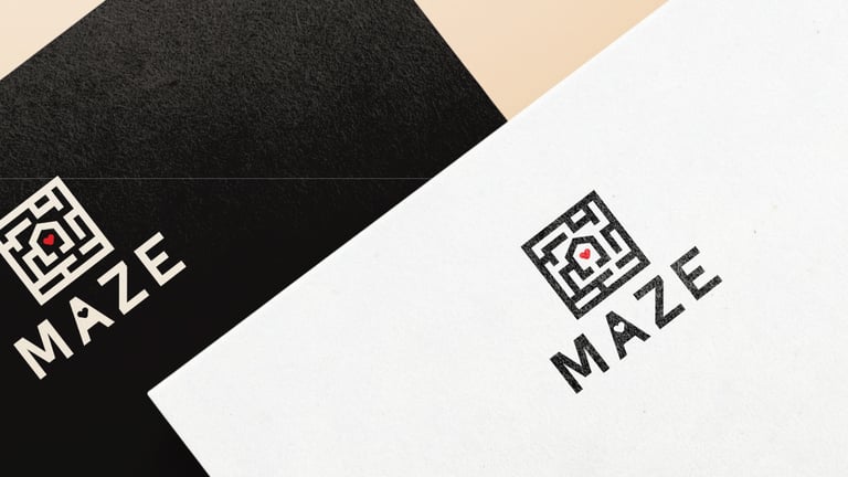
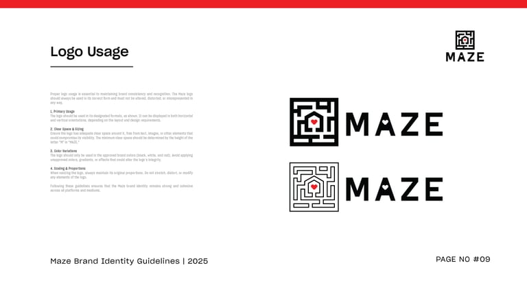
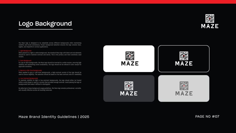
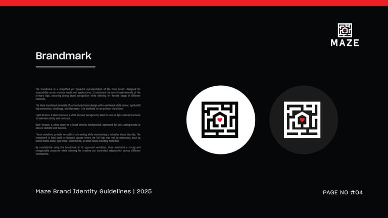
I developed a complete branding system for MAZE from the ground up. Inspired by intimacy, exploration, and elegance, I crafted a romantic yet modern brand identity—think soft neutrals, warm lighting tones, minimalist typography, and a symbol that subtly hinted at a winding path or maze. Then, I created a detailed brand guidelines document covering logo usage, typography hierarchy, color palette, imagery style, tone of voice, and social templates. This not only gave MAZE a premium, love-centric visual presence—it gave their entire team a toolkit to stay consistent as they scaled their launch across platforms. The result? A brand couples could instantly connect with, and a foundation strong enough to grow with.